Card stacks
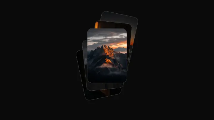
Cascade stagger
Five photo cards climb upward in a staggered cascade — each next one higher, further right and rotated a bit more; at rest the stack sits with a slight vertical offset.
React + Tailwind, shadcn-compatible: press “Copy for AI” and your Cursor or Claude Code agent installs it with the shadcn CLI.
What you can change
- the photo set via images — your own shots or covers, cycled when short
- the accent via accent — the color of photo-less plates, numbers and the focus ring
- the label prop for screen readers
A link for your AI agent: preview, code and instructions.
Preview
Use it with AI
- 1. Copy the link.
- 2. Write to your agent in your own words and drop the link into the sentence.
- 3. The agent opens the link and installs the component from the registry.
put this on the home page as the hero:
https://vibeui.club/c/stack-007?lang=en&theme=dark
Not sure where to paste it? Step-by-step guide
Show the full instructions
What the link says, spelled out. Use it when your agent cannot open links — paste this text instead.
Loading…
How to use
<Stack007 images={["/photos/1.jpg", "/photos/2.jpg", "/photos/3.jpg"]} />A sample call. The agent installs the component itself from the registry via the “Copy for AI” link.
Settings
- Open
open· default: off- Accent
accent· default: theme colour
More in Card stacks
FAQ
- How do I add Cascade stagger with Cursor or Claude Code?
- Press “Copy for AI” on this page and paste it into your agent's chat. The instruction contains the shadcn CLI install command, the dependencies and what to keep, so the agent installs this exact component instead of recreating a lookalike.
- What does Cascade stagger depend on?
- No npm packages beyond React and Tailwind CSS.
- What can I change in Cascade stagger?
- Adapt: the photo set via images — your own shots or covers, cycled when short; the accent via accent — the color of photo-less plates, numbers and the focus ring; the label prop for screen readers. Keep as installed: the local --vibeui-stack-007-* palette — do not swap it for your theme tokens; the CSS-only reveal via :hover, :focus-visible and data-open — no JS state; the linear() spring curve with its slight overshoot — that is the motion's character.
- Is Cascade stagger free?
- The preview is open to everyone; the source is available with a PRO subscription.
For developers
npx shadcn@latest add https://vibeui.club/r/pro/stack-007.jsonThis command needs a signed link: sign in and open “Component source” below — it issues a working link valid for 30 minutes. All install options
Technical notes
The component is self-contained: one file, zero dependencies, palette in local --vibeui-stack-007-* variables. It takes the theme from the environment via light-dark() plus a rule for the .dark class. Card poses are computed from props into CSS variables, and :hover / :focus-visible / data-open switch the transform — there is no JS state. Photos are <img> elements inside each card with object-fit:cover; without photos a card is a branded plate with a number. The curve is a linear() spring with a slight overshoot, and the transition is removed under prefers-reduced-motion. The reveal is fixed with no numeric props; the resting offset is --vibeui-stack-007-ty0.
Tags
- cards
- stack
- fan
- hover
- photos
- gallery
Component source
The same file your agent installs. Here in case you would rather copy it by hand.
Loading…