How to use ready-made React components in Claude Code
From inspecting the project to reviewing the diff: install VibeUI’s accordion-002, pass content through props and preserve native question expansion.
VibeUI team ·
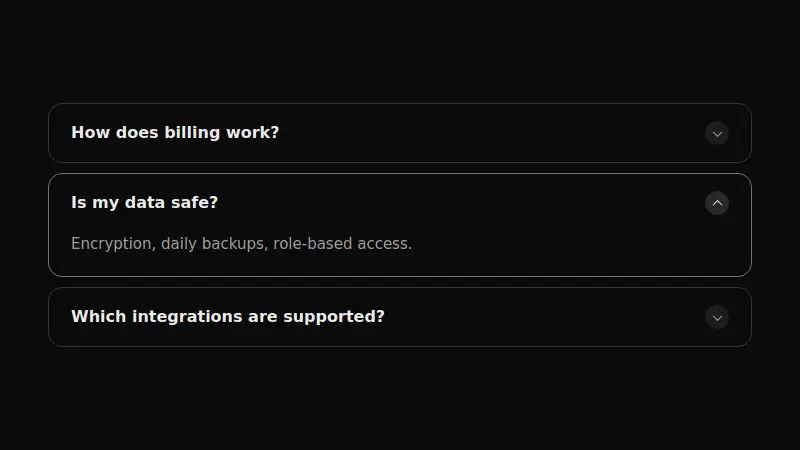
1. Let Claude Code inspect the project
Claude Code can explore files, edit code and run project commands. Before installing a component, establish where the target page lives, how imports work and whether shadcn is configured. Otherwise, the agent may create an unnecessary project or insert the component on the wrong page.
Open your folder in Claude Code, in the terminal or a supported editor, and first ask it to inspect the project. This example needs a React project with Tailwind and a configured components.json. If you do not have a project, start with the getting-started guide.
Do not edit files yet. Locate the home page, framework, components.json and project conventions. Read the applicable repository instructions. Propose a place for an FAQ list and name the files that would need changing. Do not create a new project.Save the working version in Git before installation. If you already have unfinished changes in the folder, identify them to the agent so they are not reverted along with the new component.
2. Provide instructions for a specific component
Open accordion-002. Unlike a full FAQ section, it is just the card list, so you can place it beside an existing heading. The current implementation has no internal registry dependencies or additional npm packages. It expands questions using native browser elements.
After choosing the settings, press Copy for AI and paste the fresh link into the task. It points to agent instructions, not to the JSON URL expected by shadcn add. If Claude Code asks to run a command, check its purpose and working directory.
Install accordion-002 using these instructions:
<a fresh Copy for AI link>

Place it in the agreed location on the home page. Use the registry file rather than a new implementation. Preserve details/summary, independent question expansion, markers, card styling and responsive behaviour. Show the original version first. List the installation command, added files and import location.If the agent cannot open the link, copy the full instructions from the component page and paste the text. The links inside them also expire; refresh the instructions if installation starts later.
3. Configure content through props
This component’s items prop is an array of question/answer objects. defaultOpen selects the card index initially open; -1 leaves all cards closed. marker and elevation control the indicator and styling. The snippet below is a usage example after installation, not a replacement implementation.
import { Accordion002 } from "@/components/vibeui/accordion-002"

<Accordion002
  defaultOpen={-1}
  marker="plus"
  elevation="ring"
  items={[
    { question: "Where do I start?", answer: "Choose a block and give the agent its installation instructions." },
    { question: "Can I change the copy?", answer: "Yes, through props where the component is rendered." },
  ]}
/>
The import path must match your components.json. For an actual product, replace the example with your questions and verified answers. If an answer needs links, lists or rich markup, check the API first: Accordion002 defines answer as a string, so arbitrary JSX is not accepted there.
4. Review the diff and behaviour
Ask Claude Code to show the diff. For this example, expect accordion-002.tsx and a change to the page rendering it. Package-manager files may change during CLI setup, but the accordion itself does not require a new UI library. If the agent added one, ask why before proceeding.
- Expand several questions; they should remain open independently.
- Tab to a summary and check Enter and Space.
- Supply a long real answer and check the card at a narrow width.
- Check the inherited theme and any global rules affecting card borders or text.
If installation or imports fail, use the troubleshooting guide. These checks are based on the component’s current API and source, not a recording of an automated Claude Code run in another project.
5. Keep rules for subsequent tasks
If you install blocks regularly, add brief rules to the project’s existing instructions: use registry sources, adapt content through props, preserve accessibility and review the diff. Reconcile them with existing repository rules. There is no need for a separate instruction file for every component.
The next installation should follow the same process: understand the project → install a specific component → adapt its data → check the result. Increase agent autonomy after that process works predictably in your environment.
Check editor capabilities and permission behaviour in the official Claude Code documentation.