How to improve the design of an AI-generated website
A focused improvement plan covering content, visual direction, typography and ready-made React blocks, with VibeUI examples and a task for your AI agent.
VibeUI team ·
1. Identify the specific problem
A page can work and still look arbitrary: its opening offer is unclear, sections repeat the same layout and spacing changes without a reason. Asking an agent to “make it beautiful” does not say what to fix. Start with one screen and a list of observable problems.
- Hierarchy: is the main action visible, and is it clear who the product is for?
- Composition: does every card, column and decorative element have a purpose?
- Readability: does the text fit, are button labels legible, and does the background compete with the content?
- Consistency: do type, colours, corner radii and spacing follow repeatable rules?
Write “three identical sections in a row” or “the label is hard to read on the light button”. These are testable tasks. “It needs to look more premium” still needs to be translated into concrete changes.
2. Choose one visual direction
Choose one reference page or complete scenario that fits the content. A restaurant telling its chef’s story might suit an editorial composition with portraits. An app that needs explanation might benefit from an interface demo and a sequence of steps. A large glow effect does not by itself connect those tasks.
Browse the restaurant scenario and the SaaS scenario. Compare reading order, text density and the role of images. Avoid importing every decoration you like from unrelated examples.
Write down the direction briefly: a light or dark base, one accent, heading and body typefaces, and an image approach. If a brand already exists, use its rules. The direction should clarify the page content rather than hide it.
3. Replace generic claims with useful content
Phrases such as “innovative solutions” and “unlock new possibilities” can fit almost any website. Replace them with answers: what the product does, who it serves and what to do next. A real interface screenshot or a clear process diagram helps when it explains that answer.
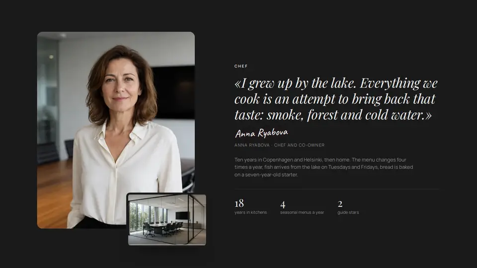
In about-007, the composition centres on a person and a story: portrait, quotation, attribution and metrics. It fits when you have your own subject and verified facts. Changing a name while keeping a demo biography does not make the section yours.
Do not ask AI to invent clients, testimonials, certificates or user counts. If evidence is not available yet, show the product working, explain the service steps or use a clearly labelled example. Supply sources for metrics and quotations, or remove them.
4. Replace one section
Save the current version in Git and choose the section with the clearest problem. If the hero already explains the offer, you do not have to start there: a generic about section or an unreadable FAQ may be a better target.
Choose a block that fits the amount of content you have. Install the original version through Copy for AI, then compare it with the preview. Follow the first Cursor guide.
After installation, change the content through supported props. Give the agent your copy, photos and actual link destinations. Avoid combining a block replacement, a site-wide palette change and rewrites of neighbouring sections in one task; it becomes difficult to tell which change helped.
5. Give the agent a bounded task
Replace the angle-bracketed line with a fresh link to your chosen block, and name the actual page section. This task asks the agent to identify the change points before editing the project.
Improve only the About section on the home page. First locate it in the code and briefly explain the planned change.

Use this VibeUI block:
<a fresh Copy for AI link>

Install the original component and its dependencies and preserve its composition. Ask me for copy, photos, quotations and metrics. Do not invent a biography, reviews or numbers. Do not change other sections, routes, forms or handlers. After replacement, list the changed files and show the result at desktop and narrow widths.6. Check the result on your page
Compare old and new versions at the same viewport width and zoom, with the same content. Otherwise, a shorter heading can be mistaken for an improvement in composition. Record what improved: a more visible action, a readable paragraph or less repetitive sections.
- Check neighbouring sections: their backgrounds, the spacing between them and heading order.
- At around 390 px, check wrapping, labels, the absence of horizontal scrolling and access to actions.
- Tab through the page. Check links, forms and the actual button destinations.
- Check reduced-motion behaviour and avoid making essential content depend on an animation finishing.
This plan helps control changes; it does not by itself establish an increase in enquiries. That conclusion requires separate traffic and action data. First make the page clear, coherent and functional, then measure its results.