Promo scenes
Flip card
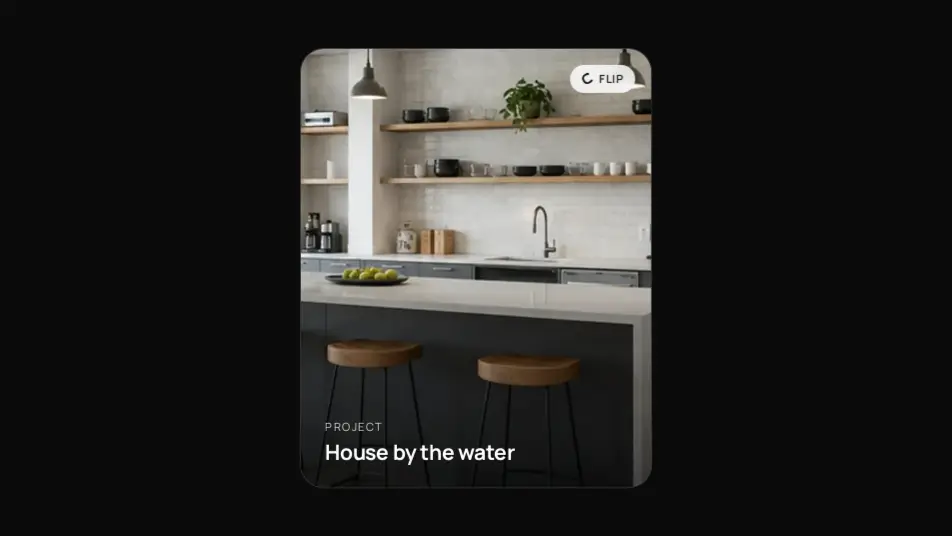
A 3D card with two sides: a photo with a caption in front, a description and a link on the back. Flips on click, keyboard or hover around a vertical or horizontal axis. Custom content for both sides via children props.
React + Tailwind, shadcn-compatible: press “Copy for AI” and your Cursor or Claude Code agent installs it with the shadcn CLI.
What you can change
- image, eyebrow, title, text, linkLabel, linkHref or fully custom front and back
- trigger (click | hover), axis (y | x), aspect, width, hint, flipped
- accent, tone, radius and duration via the --vibeui-flip-001-radius and -duration variables
A link for your AI agent: preview, code and instructions.
Preview
Use it with AI
- 1. Copy the link.
- 2. Write to your agent in your own words and drop the link into the sentence.
- 3. The agent opens the link and installs the component from the registry.
put this on the home page as the hero:
https://vibeui.club/c/flip-001?lang=en&theme=dark
Not sure where to paste it? Step-by-step guide
Show the full instructions
What the link says, spelled out. Use it when your agent cannot open links — paste this text instead.
Loading…
How to use
<Flip001
  image="/photos/house.webp"
  eyebrow="Project"
  title="House by the water"
  text="A private house on the bay: timber, glass and a terrace facing the sunset."
  linkLabel="View project"
  linkHref="/projects/house"
  trigger="click"
  axis="y"
  aspect="4 / 5"
/>
A sample call. The agent installs the component itself from the registry via the “Copy for AI” link.
Settings
- Theme
tone· default: auto- Trigger
trigger· default: click- Axis
axis· default: y- Aspect
aspect· default: 4 / 5- Title
title· default: House by the water- Hint
hint· default: flip- Accent
accent· default: theme colour
More in Promo scenes
FAQ
- How do I add Flip card with Cursor or Claude Code?
- Press “Copy for AI” on this page and paste it into your agent's chat. The instruction contains the shadcn CLI install command, the dependencies and what to keep, so the agent installs this exact component instead of recreating a lookalike.
- What does Flip card depend on?
- No npm packages beyond React and Tailwind CSS.
- What can I change in Flip card?
- Adapt: image, eyebrow, title, text, linkLabel, linkHref or fully custom front and back; trigger (click | hover), axis (y | x), aspect, width, hint, flipped; accent, tone, radius and duration via the --vibeui-flip-001-radius and -duration variables. Keep as installed: perspective on the wrapper and preserve-3d on the card — without them the flip is flat; backface-visibility:hidden and translateZ(1px) on the sides — otherwise the faces flicker midway; inert on the hidden side and stopPropagation on the back link: accessibility and no flip-back when clicking the link.
- Is Flip card free?
- Yes. The preview is open without an account; with a free account you can copy up to 20 components a month.
For developers
npx shadcn@latest add https://vibeui.club/r/pro/flip-001.jsonThis command needs a signed link: sign in and open “Component source” below — it issues a working link valid for 30 minutes. All install options
Technical notes
One file, zero dependencies, “use client” for state. The outer block holds perspective:1400px, the card has transform-style:preserve-3d and a transform transition of .8s cubic-bezier(.2,.8,.2,1); with data-flipped the card gets rotateY(180deg) (or rotateX for axis=x). Sides are absolute inset:0 with backface-visibility:hidden and translateZ(1px), the back is pre-rotated 180°. The hidden side gets the inert attribute so Tab does not land on an invisible link. trigger=hover flips via :hover without state. The back link stops click propagation so it does not flip the card back. Palette --vibeui-flip-001-* with light-dark; Manrope via <link precedence>. Aspect ratio and width are the --vibeui-flip-001-aspect and -width variables from the aspect and width props (22rem by default, max-width:100%).
Tags
- flip
- flip card
- 3d
- card
- rotate
- two-sided
- reveal
- backface
- hover
- click
Component source
The same file your agent installs. Here in case you would rather copy it by hand.
Loading…