Navbar
Floating Island Navbar
A frosted-glass header: at the top of the page three islands stand apart and wide, once you scroll the gaps collapse and they gather into a single narrow pill. The active section is marked by a glider that follows the cursor. For AI products, studios and tech presentations.
React + Tailwind, shadcn-compatible: press “Copy for AI” and your Cursor or Claude Code agent installs it with the shadcn CLI.
What you can change
- demo={false} in a project — the header sits on your content; sticky={false} drops the pinning if the page pins the header itself
- links, brand, actionLabel — the content; tone — light or graphite capsules
- inset — the air around the islands in the top state
Built from
The install command brings these components too. The block only passes them props: their palette and behaviour stay their own.
A link for your AI agent: preview, code and instructions.
Preview
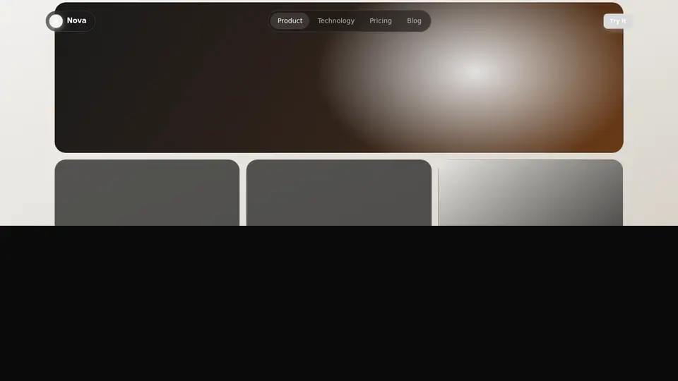
Use it with AI
- 1. Copy the link.
- 2. Write to your agent in your own words and drop the link into the sentence.
- 3. The agent opens the link and installs the component from the registry.
put this on the home page as the hero:
https://vibeui.club/c/navbar-010?lang=en&theme=dark
Not sure where to paste it? Step-by-step guide
Show the full instructions
What the link says, spelled out. Use it when your agent cannot open links — paste this text instead.
Loading…
How to use
<Navbar010 demo={false} brand="Nova" links={[{ label: "Product", href: "/p", current: true }]} actionLabel="Try it" />A sample call. The agent installs the component itself from the registry via the “Copy for AI” link.
Settings
- Theme
tone· default: auto- Brand
brand· default: Nova- Inset
inset· default: tight- Accent
accent· default: theme colour
More in Navbar
FAQ
- How do I add Floating Island Navbar with Cursor or Claude Code?
- Press “Copy for AI” on this page and paste it into your agent's chat. The instruction contains the shadcn CLI install command, the dependencies and what to keep, so the agent installs this exact component instead of recreating a lookalike.
- What does Floating Island Navbar depend on?
- No npm packages beyond React and Tailwind CSS. It also installs catalog components: button-016.
- What can I change in Floating Island Navbar?
- Adapt: demo={false} in a project — the header sits on your content; sticky={false} drops the pinning if the page pins the header itself; links, brand, actionLabel — the content; tone — light or graphite capsules; inset — the air around the islands in the top state. Keep as installed: the button-016 imports from @/components/vibeui/ — do not inline their code into the block or swap in your own; the parts receive props only; the local --vibeui-navbar-010-* palette — do not swap it for your theme tokens; the two data-scrolled states: separate islands at the top, a gathered pill after scrolling — that switch is the whole idea of the block.
- Is Floating Island Navbar free?
- Yes. The preview is open without an account; with a free account you can copy up to 20 components a month.
For developers
npx shadcn@latest add https://vibeui.club/r/pro/navbar-010.jsonThis command needs a signed link: sign in and open “Component source” below — it issues a working link valid for 30 minutes. All install options
Technical notes
A composite block: imports button-016 from @/components/vibeui/ — the install command brings them along with the block. The block owns the layout and its own text, passes the parts props only and leaves their --vibeui-<name>-* palettes alone. One file, zero npm dependencies, a client component. The islands are glass capsules: a translucent fill, a backdrop filter, an inner top highlight and a soft shadow. The two header states are told apart by the data-scrolled attribute on the dock: at the top the islands stand on their own and the bar is wider, once scrolled the island fills fade while the shared bar takes the glass, the shadow and a narrower width. The active-item glider is a separate layer under the links, positioned from offsetLeft/offsetWidth and following cursor and focus; until the JS is ready the active item keeps a plain background, so the highlight never disappears before hydration. The action button carries a glow that tracks the cursor. The mobile menu closes on Escape and on an outside click. The layout is a container query on the block's own width. All motion is removed under prefers-reduced-motion. Palette --vibeui-navbar-010-*.
Tags
- navbar
- header
- floating
- islands
- pill
- ai
- composite
Component source
The same file your agent installs. Here in case you would rather copy it by hand.
Loading…