Interface
Magnifying Dock
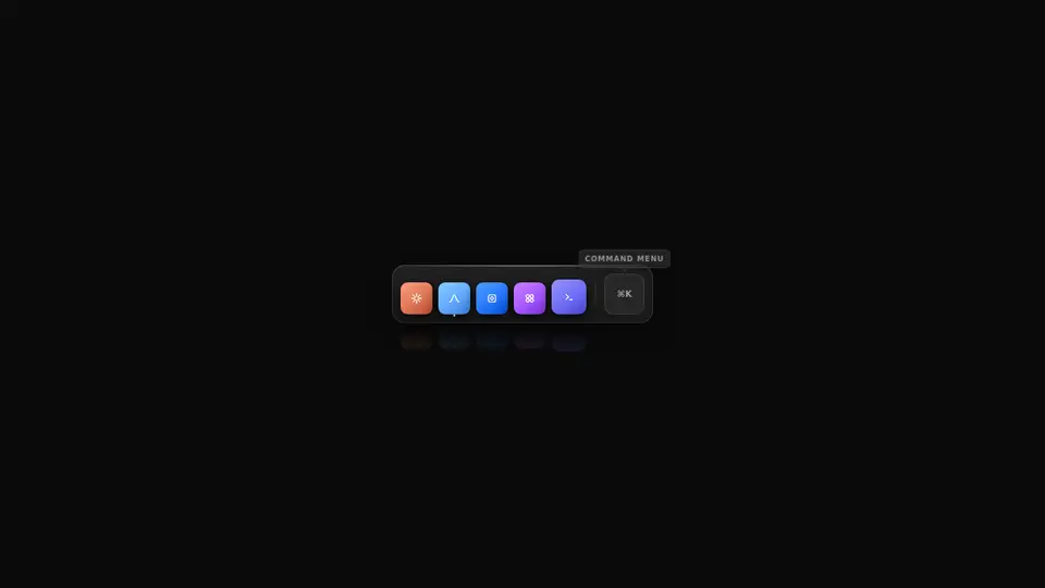
A macOS-style icon bar: the cursor drives a magnifier, icons grow on a spring, bounce on click and cast a floor reflection, running ones get a dot, and a ⌘K slot opens a small menu.
React + Tailwind, shadcn-compatible: press “Copy for AI” and your Cursor or Claude Code agent installs it with the shadcn CLI.
What you can change
- items — your own icons: an <img>, an svg or the built-in Tile; id and label are required
- activeIds — which tools carry the running-app dot
- commandLabel and commands — the slot caption and the ⌘K menu entries
A link for your AI agent: preview, code and instructions.
Preview
Use it with AI
- 1. Copy the link.
- 2. Write to your agent in your own words and drop the link into the sentence.
- 3. The agent opens the link and installs the component from the registry.
put this on the home page as the hero:
https://vibeui.club/c/button-anim-002?lang=en&theme=dark
Not sure where to paste it? Step-by-step guide
Show the full instructions
What the link says, spelled out. Use it when your agent cannot open links — paste this text instead.
Loading…
How to use
<ButtonAnim002 activeIds={["signal"]} onSelect={(item) => console.log(item.id)} />A sample call. The agent installs the component itself from the registry via the “Copy for AI” link.
Settings
- Command slot
commandLabel· default: ⌘K- Accent
accent· default: theme colour- Text colour
textColor· default: theme colour
More in Interface
FAQ
- How do I add Magnifying Dock with Cursor or Claude Code?
- Press “Copy for AI” on this page and paste it into your agent's chat. The instruction contains the shadcn CLI install command, the dependencies and what to keep, so the agent installs this exact component instead of recreating a lookalike.
- What does Magnifying Dock depend on?
- No npm packages beyond React and Tailwind CSS.
- What can I change in Magnifying Dock?
- Adapt: items — your own icons: an <img>, an svg or the built-in Tile; id and label are required; activeIds — which tools carry the running-app dot; commandLabel and commands — the slot caption and the ⌘K menu entries. Keep as installed: the icon size is written to the CSS variable --s from the handler rather than through state: pointermove is too frequent to render on every event; the raised-cosine magnification bell (not a linear tent): neighbours ease in and out of the peak; the magnifier is mouse-only and dies under prefers-reduced-motion: on touch the target is the tap point itself.
- Is Magnifying Dock free?
- The preview is open to everyone; the source is available with a PRO subscription.
For developers
npx shadcn@latest add https://vibeui.club/r/pro/button-anim-002.jsonThis command needs a signed link: sign in and open “Component source” below — it issues a working link valid for 30 minutes. All install options
Technical notes
A client component. The magnification is computed as a raised-cosine bell from the cursor's distance to each icon's centre and written straight to the CSS variable --s rather than through React state: pointermove fires dozens of times a second and rendering on each is wasted frames (the same trick as the magnetic button button-071). A width/height CSS transition smooths the steps into a spring. The magnifier is mouse-only (pointerType === 'mouse'); on touch and under prefers-reduced-motion the icons stay put. A click adds data-bounce and starts a keyframe hop, cleared on onAnimationEnd. The reflection is the same icon flipped scaleY(-1) under a gradient mask. The tooltip and the running-app dot are pure CSS (:hover/:focus-visible, data-active). The ⌘K menu is the menuOpen state. The theme comes from color-scheme through light-dark(), and the .dark class turns the dark theme on.
Tags
- button
- dock
- macos
- magnify
- toolbar
- launcher
- hover
- animated
- tooltip
- command
Component source
The same file your agent installs. Here in case you would rather copy it by hand.
Loading…