Interface
Widget grid
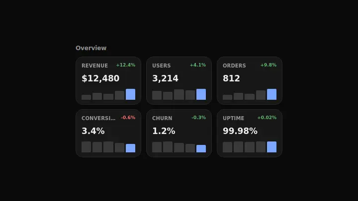
A grid of dashboard widget cards with mini bar charts: cards appear one after another with a scale-and-fade animation as the panel scrolls into view.
React + Tailwind, shadcn-compatible: press “Copy for AI” and your Cursor or Claude Code agent installs it with the shadcn CLI.
What you can change
- the widget content via widgets: title, value, trend, and mini chart points (bars)
- the grid column count via columns (2 or 3)
- the accent color via the accent prop to match your brand
A link for your AI agent: preview, code and instructions.
Preview
Use it with AI
- 1. Copy the link.
- 2. Write to your agent in your own words and drop the link into the sentence.
- 3. The agent opens the link and installs the component from the registry.
put this on the home page as the hero:
https://vibeui.club/c/dashboard-anim-002?lang=en&theme=dark
Not sure where to paste it? Step-by-step guide
Show the full instructions
What the link says, spelled out. Use it when your agent cannot open links — paste this text instead.
Loading…
How to use
<DashboardAnim002 title="Overview" columns={3} widgets={[{ label: "Revenue", value: "$12,480", trend: "+12.4%", trendTone: "up", bars: [30, 42, 38, 55, 70] }]} />A sample call. The agent installs the component itself from the registry via the “Copy for AI” link.
Settings
- Columns
columns· default: 3- Isometric
isometric· default: off- Accent
accent· default: theme colour
More in Interface
FAQ
- How do I add Widget grid with Cursor or Claude Code?
- Press “Copy for AI” on this page and paste it into your agent's chat. The instruction contains the shadcn CLI install command, the dependencies and what to keep, so the agent installs this exact component instead of recreating a lookalike.
- What does Widget grid depend on?
- No npm packages beyond React and Tailwind CSS.
- What can I change in Widget grid?
- Adapt: the widget content via widgets: title, value, trend, and mini chart points (bars); the grid column count via columns (2 or 3); the accent color via the accent prop to match your brand. Keep as installed: the local --vibeui-dashboard-anim-002-* palette — do not swap it for your theme tokens; the staggered scale-and-fade card reveal via scroll-driven view-timeline and its removal under prefers-reduced-motion; the mini bar chart inside each card with the last bar highlighted in the accent color as the current value.
- Is Widget grid free?
- The preview is open to everyone; the source is available with a PRO subscription.
For developers
npx shadcn@latest add https://vibeui.club/r/pro/dashboard-anim-002.jsonThis command needs a signed link: sign in and open “Component source” below — it issues a working link valid for 30 minutes. All install options
Technical notes
The component is self-contained: one file, zero dependencies, palette in local --vibeui-dashboard-anim-002-* variables. It takes the theme from the environment via light-dark() plus a rule for the .dark class, so it does not stay light in a dark project. Widget cards appear one after another with a scale-and-fade reveal via a scroll-driven view-timeline on the grid — the stagger comes from slicing the same timeline, with no client JS. Each card carries a metric title, a number, a trend pill, and a mini bar chart where the last bar is highlighted in the accent color as the current value. The column count switches with the columns prop (2 or 3). Everything stops under prefers-reduced-motion.
Tags
- dashboard
- widgets
- grid
- cards
- metrics
- animated
Component source
The same file your agent installs. Here in case you would rather copy it by hand.
Loading…