Interface
Uptime bar
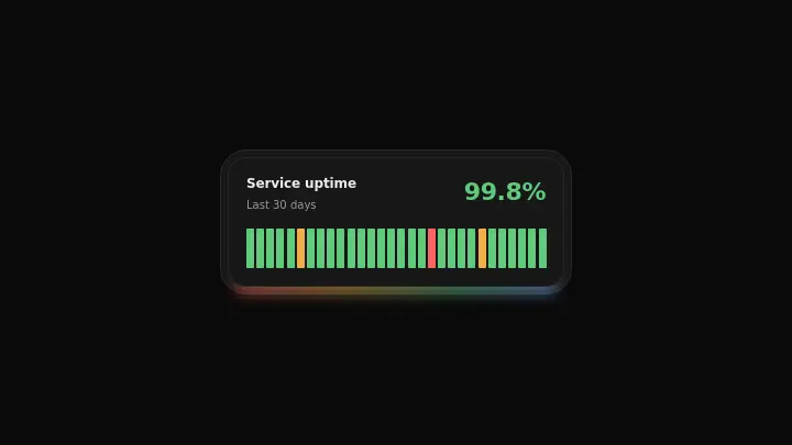
A row of thin daily bars colored by status with a large uptime percentage on top: bars grow in left to right on mount, and the percentage counts up from zero in pure CSS.
React + Tailwind, shadcn-compatible: press “Copy for AI” and your Cursor or Claude Code agent installs it with the shadcn CLI.
What you can change
- the days array: each day's status (ok/degraded/down) and its accessibility label
- the uptime value (a number with one decimal digit) and the period label
- the accent color via the accent prop to match your brand
A link for your AI agent: preview, code and instructions.
Preview
Use it with AI
- 1. Copy the link.
- 2. Write to your agent in your own words and drop the link into the sentence.
- 3. The agent opens the link and installs the component from the registry.
put this on the home page as the hero:
https://vibeui.club/c/status-002?lang=en&theme=dark
Not sure where to paste it? Step-by-step guide
Show the full instructions
What the link says, spelled out. Use it when your agent cannot open links — paste this text instead.
Loading…
How to use
<Status002 title="Service uptime" period="Last 30 days" uptime={99.8} days={[{ tone: "ok" }, { tone: "degraded" }, { tone: "ok" }]} />A sample call. The agent installs the component itself from the registry via the “Copy for AI” link.
Settings
- Glow
gradient· default: on- Isometric
isometric· default: off- Accent
accent· default: theme colour
More in Interface
FAQ
- How do I add Uptime bar with Cursor or Claude Code?
- Press “Copy for AI” on this page and paste it into your agent's chat. The instruction contains the shadcn CLI install command, the dependencies and what to keep, so the agent installs this exact component instead of recreating a lookalike.
- What does Uptime bar depend on?
- No npm packages beyond React and Tailwind CSS.
- What can I change in Uptime bar?
- Adapt: the days array: each day's status (ok/degraded/down) and its accessibility label; the uptime value (a number with one decimal digit) and the period label; the accent color via the accent prop to match your brand. Keep as installed: the local --vibeui-status-002-* palette — do not swap it for your theme tokens; the left-to-right bar reveal (stagger by day position) on mount; the pure-CSS uptime percentage counter from zero to the target value (@property + counter()).
- Is Uptime bar free?
- The preview is open to everyone; the source is available with a PRO subscription.
For developers
npx shadcn@latest add https://vibeui.club/r/pro/status-002.jsonThis command needs a signed link: sign in and open “Component source” below — it issues a working link valid for 30 minutes. All install options
Technical notes
The component is self-contained: one file, zero dependencies, palette in local --vibeui-status-002-* variables. It takes the theme from the environment via light-dark() plus a rule for the .dark class, so it does not stay light in a dark project. Bars appear left to right on mount: the start delay is computed from the day's position in the row. The large uptime percentage counts up from zero to the target value in pure CSS via a typed @property and counter() — no JS at all; where @property is unsupported, the percentage simply sits at its final value right away, so there is no degradation in the result. Everything stops under prefers-reduced-motion.
Tags
- status
- uptime
- monitoring
- bar-chart
- counter
- animated
Component source
The same file your agent installs. Here in case you would rather copy it by hand.
Loading…