Loading
Staged Status Message
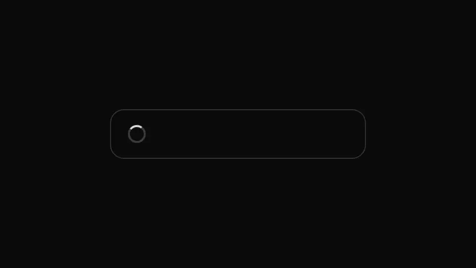
A staged status indicator: three progress messages crossfade into one another in a loop through animation-delay, with no client JS at all.
React + Tailwind, shadcn-compatible: press “Copy for AI” and your Cursor or Claude Code agent installs it with the shadcn CLI.
What you can change
- the accessible caption through label
- the three stage texts through stages
- the full-loop duration through speed in seconds
A link for your AI agent: preview, code and instructions.
Preview
Use it with AI
- 1. Copy the link.
- 2. Write to your agent in your own words and drop the link into the sentence.
- 3. The agent opens the link and installs the component from the registry.
put this on the home page as the hero:
https://vibeui.club/c/spinner-012?lang=en&theme=dark
Not sure where to paste it? Step-by-step guide
Show the full instructions
What the link says, spelled out. Use it when your agent cannot open links — paste this text instead.
Loading…
How to use
<Spinner012 label="Multi-stage loading in progress" stages={["Preparing data…", "Assembling the result…", "Almost done"]} />A sample call. The agent installs the component itself from the registry via the “Copy for AI” link.
Settings
- Screen-reader caption
label· default: Multi-stage loading in progress- Loop duration, s
speed· default: 4.5- Background
background· default: theme colour
More in Loading
FAQ
- How do I add Staged Status Message with Cursor or Claude Code?
- Press “Copy for AI” on this page and paste it into your agent's chat. The instruction contains the shadcn CLI install command, the dependencies and what to keep, so the agent installs this exact component instead of recreating a lookalike.
- What does Staged Status Message depend on?
- No npm packages beyond React and Tailwind CSS.
- What can I change in Staged Status Message?
- Adapt: the accessible caption through label; the three stage texts through stages; the full-loop duration through speed in seconds. Keep as installed: the local --vibeui-spinner-012-* palette — do not swap it for your theme tokens; exactly three stacked stages — the CSS layout and delays are computed for three; the delays derived from a single duration, speed — otherwise the tempo is edited in three places.
- Is Staged Status Message free?
- Yes. The preview is open without an account; with a free account you can copy up to 20 components a month.
For developers
npx shadcn@latest add https://vibeui.club/r/pro/spinner-012.jsonThis command needs a signed link: sign in and open “Component source” below — it issues a working link valid for 30 minutes. All install options
Technical notes
A server component, there are no hooks. The three stage lines are stacked on top of one another with absolute positioning and become visible in turn through an animation-delay computed off a single variable, --vibeui-spinner-012-speed — the same technique as in the queue of dots, only applied to text. The stage cycling is decorative and marked aria-hidden: without state there is nothing a screen reader could meaningfully announce on every frame of a CSS animation, so the accessible name is a static caption through aria-label on the root role="status". Under prefers-reduced-motion only the first stage is visible, and the ring beside the text breathes instead of spinning. The theme comes from the surrounding color-scheme through light-dark(): the component has no background by default — it sits on the page background and darkens with it, while the background prop switches on a panel.
Tags
- spinner
- stages
- status
- loading
Component source
The same file your agent installs. Here in case you would rather copy it by hand.
Loading…