Loading
Page Transition Bar
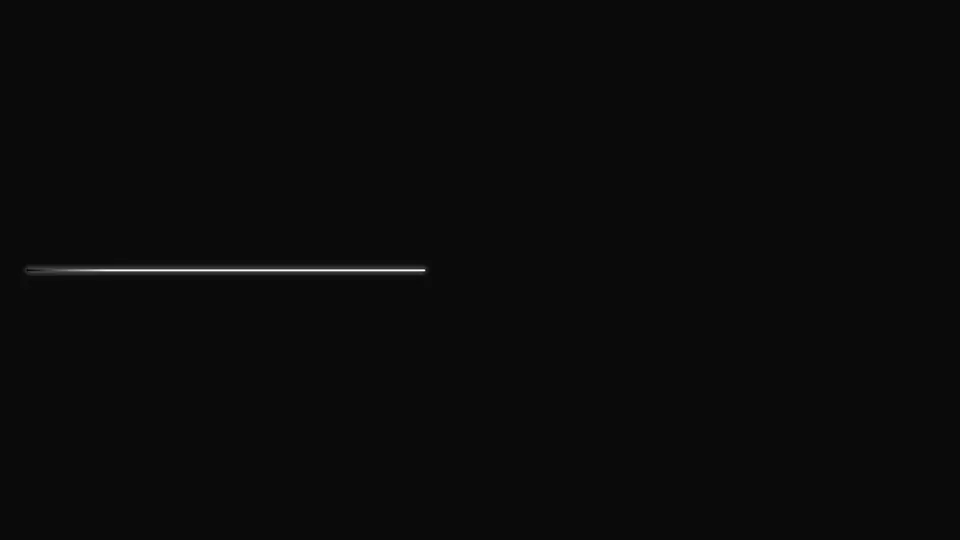
A thin bar at the top of the viewport for page transitions: jolts and a slowdown before the end say "almost there" without a made-up percent, and pointer-events:none never steals clicks from the content beneath it.
React + Tailwind, shadcn-compatible: press “Copy for AI” and your Cursor or Claude Code agent installs it with the shadcn CLI.
What you can change
- active — mount it true when a transition starts and false when it ends, driven by your router state
- label — the invisible label for screen readers
- height — the bar thickness
A link for your AI agent: preview, code and instructions.
Preview
Use it with AI
- 1. Copy the link.
- 2. Write to your agent in your own words and drop the link into the sentence.
- 3. The agent opens the link and installs the component from the registry.
put this on the home page as the hero:
https://vibeui.club/c/spinner-013?lang=en&theme=dark
Not sure where to paste it? Step-by-step guide
Show the full instructions
What the link says, spelled out. Use it when your agent cannot open links — paste this text instead.
Loading…
How to use
<Spinner013 active={isNavigating} />A sample call. The agent installs the component itself from the registry via the “Copy for AI” link.
Settings
- Active
active· default: on- Screen-reader label
label· default: Loading a new page- Thickness, px
height· default: 3- Accent
accent· default: theme colour- Track
background· default: theme colour
More in Loading
FAQ
- How do I add Page Transition Bar with Cursor or Claude Code?
- Press “Copy for AI” on this page and paste it into your agent's chat. The instruction contains the shadcn CLI install command, the dependencies and what to keep, so the agent installs this exact component instead of recreating a lookalike.
- What does Page Transition Bar depend on?
- No npm packages beyond React and Tailwind CSS.
- What can I change in Page Transition Bar?
- Adapt: active — mount it true when a transition starts and false when it ends, driven by your router state; label — the invisible label for screen readers; height — the bar thickness. Keep as installed: the local --vibeui-spinner-013-* palette — do not swap it for your theme tokens; position:fixed at the top edge of the viewport with a maximum z-index — the bar has to sit above everything; pointer-events:none — the bar must never intercept clicks on the content beneath it.
- Is Page Transition Bar free?
- Yes. The preview is open without an account; with a free account you can copy up to 20 components a month.
For developers
npx shadcn@latest add https://vibeui.club/r/pro/spinner-013.jsonThis command needs a signed link: sign in and open “Component source” below — it issues a working link valid for 30 minutes. All install options
Technical notes
The component is self-contained: one file, no dependencies, its own palette in the local --vibeui-spinner-013-* variables. Server-side: there are no hooks, active drives rendering from outside. The bar sits position:fixed at the top edge of the viewport with a maximum z-index and pointer-events:none, so it never covers clicks on the content beneath it. The bar carries no visible text — role="status" with an invisible aria-live label announces the transition to assistive technology the moment the block mounts. The fill is not a percent but a decorative deceleration: for a page transition nobody actually knows the true share done. Under prefers-reduced-motion the run is replaced by an opacity breath at a fixed width. The theme comes from the surrounding color-scheme through light-dark(). The track is transparent by default — the background prop gives it a visible colour. The showcase-only inline prop moves the bar from fixed into the flow of its own container: it is meant for the catalog card and screenshots, while in an app the bar stays above the page.
Tags
- spinner
- loading
- route
- progress
Component source
The same file your agent installs. Here in case you would rather copy it by hand.
Loading…