Checkbox & toggles
Rating Scale Radio
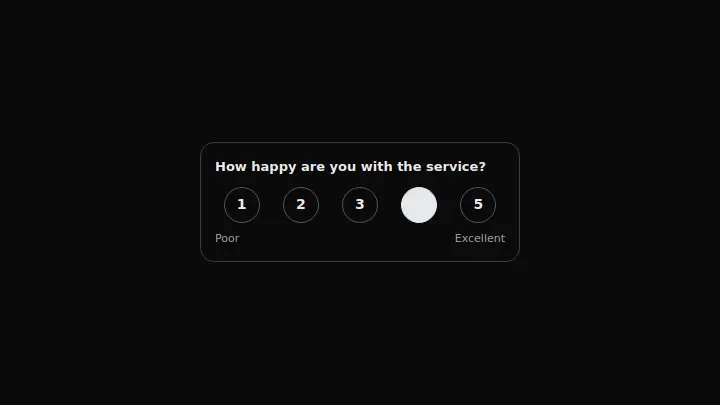
A one-to-five rating scale: five numbered circles in a row and pole labels under the scale, with no label on the middle marks.
React + Tailwind, shadcn-compatible: press “Copy for AI” and your Cursor or Claude Code agent installs it with the shadcn CLI.
What you can change
- the legend with the question text
- lowLabel and highLabel — the scale's pole labels
- optionLabel — the template for a mark's accessible name, with {value} and {total} placeholders
A link for your AI agent: preview, code and instructions.
Preview
Use it with AI
- 1. Copy the link.
- 2. Write to your agent in your own words and drop the link into the sentence.
- 3. The agent opens the link and installs the component from the registry.
put this on the home page as the hero:
https://vibeui.club/c/radio-013?lang=en&theme=dark
Not sure where to paste it? Step-by-step guide
Show the full instructions
What the link says, spelled out. Use it when your agent cannot open links — paste this text instead.
Loading…
How to use
<Radio013 legend="How likely are you to recommend us?" lowLabel="Not likely" highLabel="Definitely" defaultValue="5" />A sample call. The agent installs the component itself from the registry via the “Copy for AI” link.
Settings
- Question
legend· default: How happy are you with the service?- Selected rating
defaultValue· default: 4- Accent
accent· default: theme colour- Background
background· default: theme colour
More in Checkbox & toggles
FAQ
- How do I add Rating Scale Radio with Cursor or Claude Code?
- Press “Copy for AI” on this page and paste it into your agent's chat. The instruction contains the shadcn CLI install command, the dependencies and what to keep, so the agent installs this exact component instead of recreating a lookalike.
- What does Rating Scale Radio depend on?
- No npm packages beyond React and Tailwind CSS.
- What can I change in Rating Scale Radio?
- Adapt: the legend with the question text; lowLabel and highLabel — the scale's pole labels; optionLabel — the template for a mark's accessible name, with {value} and {total} placeholders. Keep as installed: the local --vibeui-radio-013-* palette — do not swap it for your theme tokens; the fixed five-point scale — only the poles need labels, not every mark; the aria-label with the number and the scale's total on every radio button.
- Is Rating Scale Radio free?
- Yes. The preview is open without an account; with a free account you can copy up to 20 components a month.
For developers
npx shadcn@latest add https://vibeui.club/r/pro/radio-013.jsonThis command needs a signed link: sign in and open “Component source” below — it issues a working link valid for 30 minutes. All install options
Technical notes
The component is self-contained: one file, no dependencies, its own palette in the local --vibeui-radio-013-* variables. Server-side: there are no hooks, the radio buttons hold the state. The scale is fixed at five marks: the digit inside the circle is the value itself, and every button's accessible name is refined through aria-label.
Tags
- radio
- rating
- scale
- form
Component source
The same file your agent installs. Here in case you would rather copy it by hand.
Loading…