Industry sections
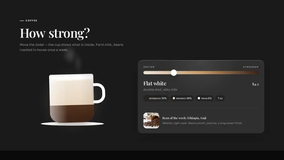
Coffee strength slider with a filling cup
A “softer — stronger” slider switches drinks from latte to espresso while the cup photo crossfades with a slight “sip”; when the drinks have no photos a drawn cup fills with layers — coffee, milk, foam — with smooth height transitions. CSS steam above the cup. On the right: name, composition in percent, volume, price and the bean of the week.
React + Tailwind, shadcn-compatible: press “Copy for AI” and your Cursor or Claude Code agent installs it with the shadcn CLI.
What you can change
- drinks: name, text, price, coffee, milk, foam, volume, water, image, imageAlt
- eyebrow, title, lede, softLabel, strongLabel, initial
- beanImage, beanTitle, beanText
A link for your AI agent: preview, code and instructions.
Preview
Use it with AI
- 1. Copy the link.
- 2. Write to your agent in your own words and drop the link into the sentence.
- 3. The agent opens the link and installs the component from the registry.
put this on the home page as the hero:
https://vibeui.club/c/bakery-002?lang=en&theme=dark
Not sure where to paste it? Step-by-step guide
Show the full instructions
What the link says, spelled out. Use it when your agent cannot open links — paste this text instead.
Loading…
How to use
<Bakery002
  title="How strong?"
  drinks={[
    { name: "Latte", price: "$4.5", coffee: 20, milk: 62, foam: 10, volume: "12 oz" },
    { name: "Espresso", price: "$3", coffee: 30, milk: 0, foam: 0, volume: "2 oz" },
  ]}
  beanImage="/photos/beans.webp"
/>
A sample call. The agent installs the component itself from the registry via the “Copy for AI” link.
Settings
- Title
title· default: How strong?- Theme
tone· default: auto- Accent
accent· default: theme colour- Ink
ink· default: theme colour- Background
background· default: theme colour
Used in scenarios
- Café-bakeryCoffee
More in Industry sections
- Breakfast box builder
- Scroll story “36 hours to a loaf”
- Punch card with stamps and a bread subscription
- “What your amount buys”: chips, a slider and a redrawing card
- Beneficiary stories: a drag-scroll lane of envelopes with a typing letter
- Foundation reporting: a donut chart by year and a “0% on ads” stamp
FAQ
- How do I add Coffee strength slider with a filling cup with Cursor or Claude Code?
- Press “Copy for AI” on this page and paste it into your agent's chat. The instruction contains the shadcn CLI install command, the dependencies and what to keep, so the agent installs this exact component instead of recreating a lookalike.
- What does Coffee strength slider with a filling cup depend on?
- No npm packages beyond React and Tailwind CSS.
- What can I change in Coffee strength slider with a filling cup?
- Adapt: drinks: name, text, price, coffee, milk, foam, volume, water, image, imageAlt; eyebrow, title, lede, softLabel, strongLabel, initial; beanImage, beanTitle, beanText. Keep as installed: the imports from @/components/vibeui/ — do not inline their code into the block or swap in your own; the parts receive props only; drink photos are stacked img[data-active], the active one has opacity 1 and scale 1, switching runs the sip keyframes; without photos the cup layers transition height and bottom; the cup gets shorter towards strong drinks: 10rem + a 1.75rem step per position.
- Is Coffee strength slider with a filling cup free?
- The preview is open to everyone; the source is available with a PRO subscription.
For developers
npx shadcn@latest add https://vibeui.club/r/pro/bakery-002.jsonThis command needs a signed link: sign in and open “Component source” below — it issues a working link valid for 30 minutes. All install options
Technical notes
A composite block: imports from @/components/vibeui/ — the install command brings them along with the block. The block owns the layout and its own text, passes the parts props only and leaves their --vibeui-<name>-* palettes alone.
Tags
- coffee
- cafe
- bakery
- slider
- menu
- interactive
- drink
- range
- illustration
- composite
Component source
The same file your agent installs. Here in case you would rather copy it by hand.
Loading…