Industry sections
Gadget exploded view: parts spread apart by a slider and in the viewport
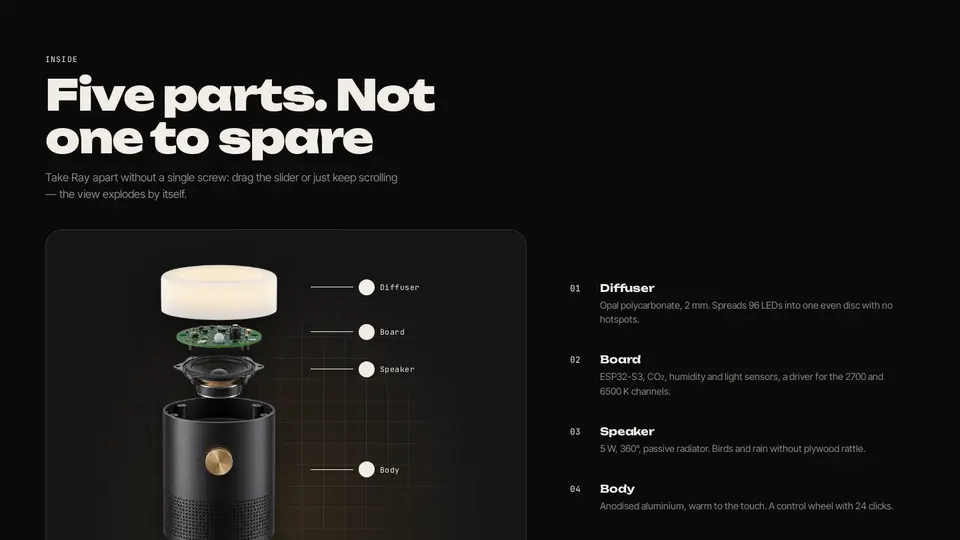
A gadget exploded view: two renders — the assembled lamp and the one split into five parts — stacked on top of each other; the “disassemble” slider fades in the exploded one and the numbered label lines slide to their parts. Without renders the parts are drawn in CSS and spread vertically. On entering the viewport the scheme explodes by itself, a button reassembles it; hovering a list item highlights its label.
React + Tailwind, shadcn-compatible: press “Copy for AI” and your Cursor or Claude Code agent installs it with the shadcn CLI.
What you can change
- assembledImage, explodedImage — two renders in the same framing; label tops are tuned to the scheme
- eyebrow, title, lede
- parts: name, text (exactly five, top to bottom)
Built from
The install command brings these components too. The block only passes them props: their palette and behaviour stay their own.
A link for your AI agent: preview, code and instructions.
Preview
Use it with AI
- 1. Copy the link.
- 2. Write to your agent in your own words and drop the link into the sentence.
- 3. The agent opens the link and installs the component from the registry.
put this on the home page as the hero:
https://vibeui.club/c/gadget-002?lang=en&theme=dark
Not sure where to paste it? Step-by-step guide
Show the full instructions
What the link says, spelled out. Use it when your agent cannot open links — paste this text instead.
Loading…
How to use
<Gadget002
  assembledImage="/photos/lamp-front.png"
  explodedImage="/photos/lamp-exploded.png"
  title="Five parts. Not one to spare"
  parts={[
    { name: "Diffuser", text: "Opal polycarbonate, 2 mm." },
    { name: "Board", text: "ESP32-S3 and sensors." },
    { name: "Speaker", text: "5 W, 360°." },
    { name: "Body", text: "Anodised aluminium." },
    { name: "Base", text: "A 480 g steel puck." },
  ]}
/>
A sample call. The agent installs the component itself from the registry via the “Copy for AI” link.
Settings
- Title
title· default: Five parts. Not one to spare- Eyebrow
eyebrow· default: Inside- Theme
tone· default: auto- Accent
accent· default: theme colour- Ink
ink· default: theme colour- Background
background· default: theme colour
Used in scenarios
- Gadget & hardwareInside
More in Industry sections
- Gadget preorder: swatches recolour the lamp, a shipping countdown, a magnetic button
- Level test: five chip questions and an A1–C1 scale with a marker
- Group schedule: week × time, filters and “next start in N days”
- Three-month progress: a vocabulary chart with a week slider
- Showcase with filters, FLIP reordering and a license quick view
- Bundle builder with a growing-discount scale and a mini cart
FAQ
- How do I add Gadget exploded view: parts spread apart by a slider and in the viewport with Cursor or Claude Code?
- Press “Copy for AI” on this page and paste it into your agent's chat. The instruction contains the shadcn CLI install command, the dependencies and what to keep, so the agent installs this exact component instead of recreating a lookalike.
- What does Gadget exploded view: parts spread apart by a slider and in the viewport depend on?
- No npm packages beyond React and Tailwind CSS. It also installs catalog components: card-101.
- What can I change in Gadget exploded view: parts spread apart by a slider and in the viewport?
- Adapt: assembledImage, explodedImage — two renders in the same framing; label tops are tuned to the scheme; eyebrow, title, lede; parts: name, text (exactly five, top to bottom). Keep as installed: the card-101 imports from @/components/vibeui/ — do not inline their code into the block or swap in your own; the parts receive props only; with renders: assembled opacity = 1 − e, exploded = e; [data-part=tag][data-kind] labels shift by --ty × (1 − e); each part is a data-part=piece with its own -o, transform: translate(-50%, calc(-o × -e)); the .9 s transition is enabled only via data-scene-smooth.
- Is Gadget exploded view: parts spread apart by a slider and in the viewport free?
- The preview is open to everyone; the source is available with a PRO subscription.
For developers
npx shadcn@latest add https://vibeui.club/r/pro/gadget-002.jsonThis command needs a signed link: sign in and open “Component source” below — it issues a working link valid for 30 minutes. All install options
Technical notes
A composite block: imports card-101 from @/components/vibeui/ — the install command brings them along with the block. The block owns the layout and its own text, passes the parts props only and leaves their --vibeui-<name>-* palettes alone.
Tags
- gadget
- hardware
- exploded-view
- parts
- teardown
- interactive
- slider
- css-art
- product
- engineering
- composite
Component source
The same file your agent installs. Here in case you would rather copy it by hand.
Loading…