Industry sections
Episode List
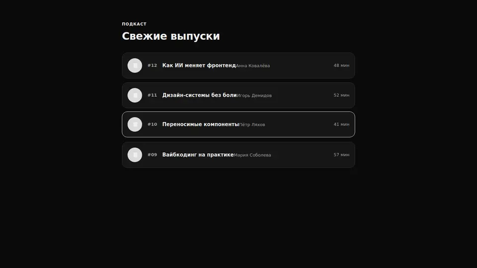
A podcast episode feed: rows with a play button, number, title, guest and duration. The whole row is a link. Self-contained — one file, no dependencies.
React + Tailwind, shadcn-compatible: press “Copy for AI” and your Cursor or Claude Code agent installs it with the shadcn CLI.
What you can change
- eyebrow, title and playLabel — the eyebrow, heading and action label
- the episodes array — number, title, guest and duration of each episode
- the accent via the accent prop — play button, number and border
Built from
The install command brings these components too. The block only passes them props: their palette and behaviour stay their own.
A link for your AI agent: preview, code and instructions.
Preview
Use it with AI
- 1. Copy the link.
- 2. Write to your agent in your own words and drop the link into the sentence.
- 3. The agent opens the link and installs the component from the registry.
put this on the home page as the hero:
https://vibeui.club/c/podcast-001?lang=en&theme=dark
Not sure where to paste it? Step-by-step guide
Show the full instructions
What the link says, spelled out. Use it when your agent cannot open links — paste this text instead.
Loading…
How to use
<Podcast001
  episodes={[{ number: "12", title: "Episode", guest: "Guest", duration: "48 min" }]}
/>
A sample call. The agent installs the component itself from the registry via the “Copy for AI” link.
Settings
- Title
title· default: Latest episodes- Eyebrow
eyebrow· default: Podcast- Accent
accent· default: theme colour- Background
background· default: theme colour
More in Industry sections
FAQ
- How do I add Episode List with Cursor or Claude Code?
- Press “Copy for AI” on this page and paste it into your agent's chat. The instruction contains the shadcn CLI install command, the dependencies and what to keep, so the agent installs this exact component instead of recreating a lookalike.
- What does Episode List depend on?
- No npm packages beyond React and Tailwind CSS. It also installs catalog components: heading-001.
- What can I change in Episode List?
- Adapt: eyebrow, title and playLabel — the eyebrow, heading and action label; the episodes array — number, title, guest and duration of each episode; the accent via the accent prop — play button, number and border. Keep as installed: the heading-001 imports from @/components/vibeui/ — do not inline their code into the block or swap in your own; the parts receive props only; the local --vibeui-podcast-001-* palette — do not swap it for your theme tokens; the play button from borders (circle + triangle) without an icon font.
- Is Episode List free?
- Yes. The preview is open without an account; with a free account you can copy up to 20 components a month.
For developers
npx shadcn@latest add https://vibeui.club/r/pro/podcast-001.jsonThis command needs a signed link: sign in and open “Component source” below — it issues a working link valid for 30 minutes. All install options
Technical notes
A composite block: imports heading-001 from @/components/vibeui/ — the install command brings them along with the block. The block owns the layout and its own text, passes the parts props only and leaves their --vibeui-<name>-* palettes alone. The block is self-contained: one file, no npm dependencies, its own palette in the local --vibeui-podcast-001-* variables. A server component. An episode row is a grid: a play button (circle with a triangle from borders), the number, the info (title and guest) and duration. The row is a whole link with an aria-label; playback is wired by the app.
Tags
- podcast
- episodes
- audio
- listing
- marketing
- composite
Component source
The same file your agent installs. Here in case you would rather copy it by hand.
Loading…