Industry sections
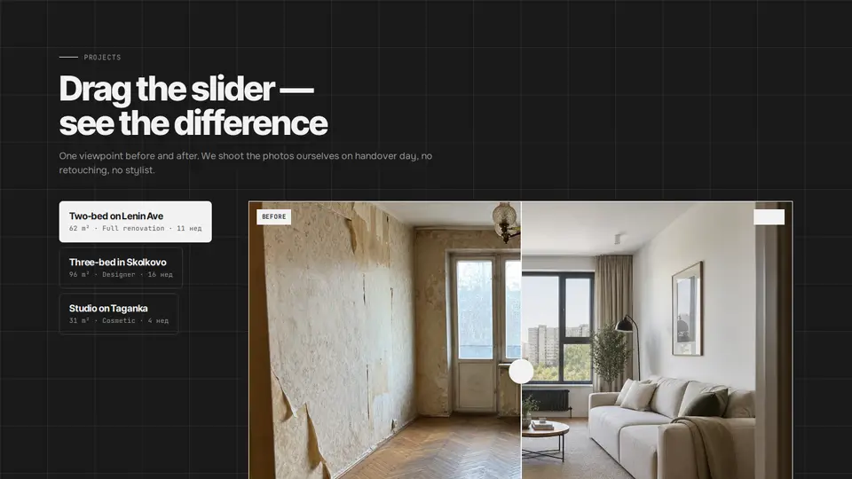
Before/after projects with a comparison slider and a project switcher
Before/after projects: a list of project tabs with area, type and duration on the left, a comparison on the right — the “after” photo in full, the “before” photo on top clipped with clip-path to the slider position. The slider is an invisible full-size range: works with a finger, a mouse and arrow keys. A handle with two arrows and a “before | after” caption in percent. Under the photo the project facts as mono cells and a description. On switching projects the slider eases back to the middle.
React + Tailwind, shadcn-compatible: press “Copy for AI” and your Cursor or Claude Code agent installs it with the shadcn CLI.
What you can change
- eyebrow, title, lede, beforeLabel, afterLabel, defaultPosition
- works: name, before, after, type, weeks, price, area, text
- tone — theme
Built from
The install command brings these components too. The block only passes them props: their palette and behaviour stay their own.
A link for your AI agent: preview, code and instructions.
Preview
Use it with AI
- 1. Copy the link.
- 2. Write to your agent in your own words and drop the link into the sentence.
- 3. The agent opens the link and installs the component from the registry.
put this on the home page as the hero:
https://vibeui.club/c/renovation-003?lang=en&theme=dark
Not sure where to paste it? Step-by-step guide
Show the full instructions
What the link says, spelled out. Use it when your agent cannot open links — paste this text instead.
Loading…
How to use
<Renovation003
  works={[
    { name: "Two-bed on Lenin Ave", before: "/photos/before-01.webp", after: "/photos/after-01.webp", type: "Full renovation", weeks: 11, price: "$128k", area: "62 m²" },
  ]}
/>
A sample call. The agent installs the component itself from the registry via the “Copy for AI” link.
Settings
- Title
title· default: Drag the slider — see the difference- Slider, %
defaultPosition· default: 50- Theme
tone· default: auto- Accent
accent· default: theme colour- Ink
ink· default: theme colour- Background
background· default: theme colour
Used in scenarios
- Apartment renovationProjects
More in Industry sections
- Site live: a progress ring driven by today's date and a day-by-day report feed
- Emergency “Urgent” button with a “what to do now” panel
- Pet map: an SVG body scheme with service hotspots
- Symptom checker: chips → which doctor and how urgent
- Grooming: a haircut length slider with a CSS pet and a calculator
- The book: a 3D cover that opens, formats and a page counter
FAQ
- How do I add Before/after projects with a comparison slider and a project switcher with Cursor or Claude Code?
- Press “Copy for AI” on this page and paste it into your agent's chat. The instruction contains the shadcn CLI install command, the dependencies and what to keep, so the agent installs this exact component instead of recreating a lookalike.
- What does Before/after projects with a comparison slider and a project switcher depend on?
- No npm packages beyond React and Tailwind CSS. It also installs catalog components: button-086.
- What can I change in Before/after projects with a comparison slider and a project switcher?
- Adapt: eyebrow, title, lede, beforeLabel, afterLabel, defaultPosition; works: name, before, after, type, weeks, price, area, text; tone — theme. Keep as installed: the button-086 imports from @/components/vibeui/ — do not inline their code into the block or swap in your own; the parts receive props only; the slider is an input type=range with opacity:0 over the area, its value writes --x; the “before” photo is clipped with clip-path:inset(0 calc(100% - var(--x)) 0 0); the handle sits at left:var(--x); on project change data-settling enables a transition on clip-path and left, the first pointerdown/keydown removes it.
- Is Before/after projects with a comparison slider and a project switcher free?
- The preview is open to everyone; the source is available with a PRO subscription.
For developers
npx shadcn@latest add https://vibeui.club/r/pro/renovation-003.jsonThis command needs a signed link: sign in and open “Component source” below — it issues a working link valid for 30 minutes. All install options
Technical notes
A composite block: imports button-086 from @/components/vibeui/ — the install command brings them along with the block. The block owns the layout and its own text, passes the parts props only and leaves their --vibeui-<name>-* palettes alone.
Tags
- before after
- comparison
- slider
- portfolio
- projects
- renovation
- construction
- gallery
- tabs
- clip-path
- interactive
- composite
Component source
The same file your agent installs. Here in case you would rather copy it by hand.
Loading…