Chart
Sparkline Rows
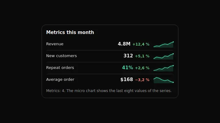
Metrics as rows, each with its own micro chart: the numbers answer "where it stands", the sparkline answers "how it got there", and both read in one glance.
React + Tailwind, shadcn-compatible: press “Copy for AI” and your Cursor or Claude Code agent installs it with the shadcn CLI.
What you can change
- the rows through rows: label, value, change and series on each
- the heading through title and the caption through unitLabel with the {count} placeholder
- which direction counts as good through riseIsGood
A link for your AI agent: preview, code and instructions.
Preview
Use it with AI
- 1. Copy the link.
- 2. Write to your agent in your own words and drop the link into the sentence.
- 3. The agent opens the link and installs the component from the registry.
put this on the home page as the hero:
https://vibeui.club/c/chart-026?lang=en&theme=dark
Not sure where to paste it? Step-by-step guide
Show the full instructions
What the link says, spelled out. Use it when your agent cannot open links — paste this text instead.
Loading…
How to use
<Chart026
  title="Metrics this month"
  rows={[{ label: "Revenue", value: "4.8M", change: 12.4, series: [31, 34, 33, 38] }]}
/>
A sample call. The agent installs the component itself from the registry via the “Copy for AI” link.
Settings
- Heading
title· default: Metrics this month- Growth is good
riseIsGood· default: on- Accent
accent· default: theme colour- Background
background· default: theme colour- Entrance animation
animate· default: on
More in Chart
FAQ
- How do I add Sparkline Rows with Cursor or Claude Code?
- Press “Copy for AI” on this page and paste it into your agent's chat. The instruction contains the shadcn CLI install command, the dependencies and what to keep, so the agent installs this exact component instead of recreating a lookalike.
- What does Sparkline Rows depend on?
- No npm packages beyond React and Tailwind CSS.
- What can I change in Sparkline Rows?
- Adapt: the rows through rows: label, value, change and series on each; the heading through title and the caption through unitLabel with the {count} placeholder; which direction counts as good through riseIsGood. Keep as installed: the local --vibeui-chart-026-* palette: the component must look the same in any project; the hidden data table: the SVG is aria-hidden, and without it the chart is unreachable for a screen reader; normalising each series against its own min and max — sparklines compare shape, not height.
- Is Sparkline Rows free?
- Yes. The preview is open without an account; with a free account you can copy up to 20 components a month.
For developers
npx shadcn@latest add https://vibeui.club/r/pro/chart-026.jsonThis command needs a signed link: sign in and open “Component source” below — it issues a working link valid for 30 minutes. All install options
Technical notes
One file, zero dependencies, the --vibeui-chart-026-* palette. A server component. Every row is a three-column grid: name, figures, micro chart. The sparkline is a 68×22 SVG with preserveAspectRatio=none, so it stretches to the column without recomputing paths; each series is normalised against its own min and max rather than a shared scale — the shapes are compared, not the heights. The change colour follows the riseIsGood prop: where growth means loss (churn, response time), a plus sign has to be red. Below 24rem the layout drops to two columns and the sparkline moves under the row at full width. The data is mirrored in a hidden table: the SVG is aria-hidden. Motion: rows slide in one after another, sparklines draw left to right; reduced motion shows everything at once; animate=false turns it off.
Tags
- chart
- sparkline
- metrics
- dashboard
- animated
Component source
The same file your agent installs. Here in case you would rather copy it by hand.
Loading…