Calendar
Capped Range
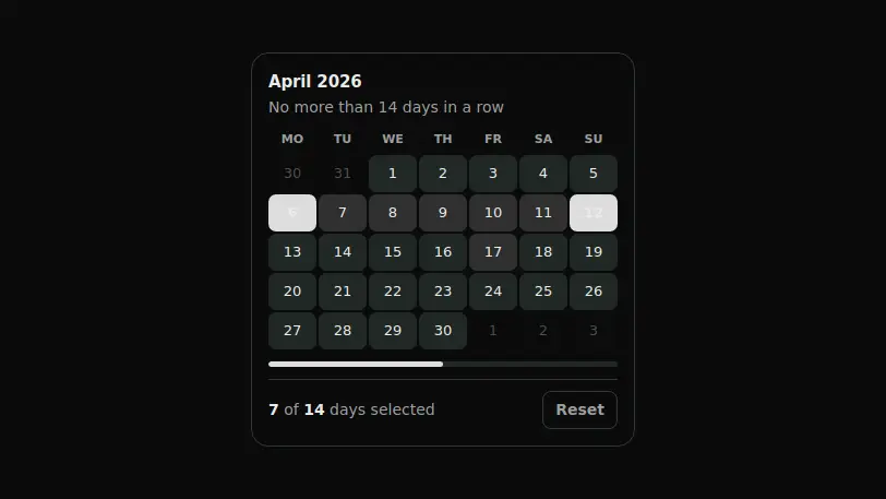
A range with a hard cap of N days: once the first date is picked the unreachable days go dim, and the counter below shows how much of the limit is left.
React + Tailwind, shadcn-compatible: press “Copy for AI” and your Cursor or Claude Code agent installs it with the shadcn CLI.
What you can change
- month — the displayed month as a YYYY-MM string
- maxDays — the maximum range length in days
- defaultFrom and defaultTo — the bounds selected at first render
A link for your AI agent: preview, code and instructions.
Preview
Use it with AI
- 1. Copy the link.
- 2. Write to your agent in your own words and drop the link into the sentence.
- 3. The agent opens the link and installs the component from the registry.
put this on the home page as the hero:
https://vibeui.club/c/calendar-030?lang=en&theme=dark
Not sure where to paste it? Step-by-step guide
Show the full instructions
What the link says, spelled out. Use it when your agent cannot open links — paste this text instead.
Loading…
How to use
<Calendar030 maxDays={14} month="2026-04" />A sample call. The agent installs the component itself from the registry via the “Copy for AI” link.
Settings
- Maximum days
maxDays· default: 14- Accent
accent· default: theme colour- Surface
background· default: theme colour- Month
month· default: 2026-04
More in Calendar
FAQ
- How do I add Capped Range with Cursor or Claude Code?
- Press “Copy for AI” on this page and paste it into your agent's chat. The instruction contains the shadcn CLI install command, the dependencies and what to keep, so the agent installs this exact component instead of recreating a lookalike.
- What does Capped Range depend on?
- No npm packages beyond React and Tailwind CSS.
- What can I change in Capped Range?
- Adapt: month — the displayed month as a YYYY-MM string; maxDays — the maximum range length in days; defaultFrom and defaultTo — the bounds selected at first render. Keep as installed: the local --vibeui-calendar-030-* palette — do not swap it for your theme tokens (bg-accent, text-muted-foreground and the like); expressing the cap as grid state rather than a post-submit error: the restriction has to be visible before the click; the native disabled attribute on unreachable days — it removes them from the tab order and is announced by screen readers.
- Is Capped Range free?
- The preview is open to everyone; the source is available with a PRO subscription.
For developers
npx shadcn@latest add https://vibeui.club/r/pro/calendar-030.jsonThis command needs a signed link: sign in and open “Component source” below — it issues a working link valid for 30 minutes. All install options
Technical notes
The component is self-contained: one file, zero dependencies, its own palette in local variables --vibeui-calendar-030-*. Client-side: both bounds of the range live in useState. The limit is expressed not by an error message but by the state of the grid: while only the first date is selected, the blocked function dims the days earlier than the start and further than maxDays-1 through the native disabled, so the ban is announced to a screen reader too. The number of grid rows is computed as Math.ceil((offset+days)/7)*7, so the month does not leave an empty sixth week. The progress bar under the grid is filled by the variable --vibeui-calendar-030-fill from the ratio of the range length to the limit. The total is declined through pluralize and announced through aria-live. The theme comes from the surrounding color-scheme through light-dark(): the component has no surface of its own by default, it sits directly on the page background and darkens along with it, while the background prop brings the panel back. The captions arrive in the text dictionary with the substitutions {max}, {count} and {unit}; the substitution returns nodes, so the numbers stay inside <b> and the word order is set by the translation.
Tags
- calendar
- range
- limit
- booking
Component source
The same file your agent installs. Here in case you would rather copy it by hand.
Loading…